AMBER FIELDING
Create Your First Project
Start adding your projects to your portfolio. Click on "Manage Projects" to get started
Be Kind Festival
Project type
Branding
Date
2022
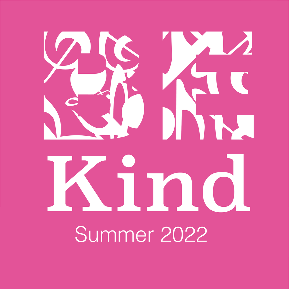
This is my branding for the festival "Be Kind" that will be located in Manchester. It's a music festival that supports and raises awareness of mental health. I first looked into Manchester and its most famous icons and tourist attractions. I saw quite a lot of unique aspects including the architecture, the famous bee and the football team, Manchester United. From this and the knowledge of the festival being music and mental health orientated, I drew up my first sketches and prototypes. I finally came up with the logo I am showing you today as it has multiple elements that relate to the topic subtly. I have used a soft font to look kind and inviting to the viewer emphasising the meaning of the festival - to be kind. I have used bright bold colours in order to keep the same style of the "YANA" festival and to attract the eye whilst also showing inclusivity with multiple colours used. The word "BE" has been cut out of shapes that represent music notes to symbolise what the festival is about without being too obvious. I have put the word "BE" in capital letters to grab the people's attention and show a slight but kind sternness to convey the importance and order of the word, whereas I have used both upper and lower case letters for the word "Kind" to emphasise the meaning and gentleness of the word. Finally, I put the logo on a dark background to help it stand out and contrast with the bright and bold font of the logo.
After perfecting my logo I moved onto my social media images in order to support and promote the festival and its branding. I was thinking about how the logo looks and how I can use the logo in different ways to promote the festival whilst still keeping the original look and colours to keep the logo flowing and easily recognisable. I wanted to use the colours within the logo but expand them out to keep each design looking fresh and eye-catching, whilst it pops due to its contrasting nature. I kept the logo centred and large to get straight to the point, to get you thinking about what the branding is about and therefore, to help keep it in your mind.
Finally, I made my poster and again I wanted to bring in elements from the logo to emphasise the logo and help you remember it. I used the outline of the logo's shapes to create an unusual and unique pattern in order to entertain the eye whilst also giving the most important information. I used a random location as a placeholder for the actual location in order to help visualise what it would look like properly. I used a gradient background to help drag the eye around the poster and direct it towards the information and the logo to make sure the viewer sees all the information. Again, I used the same colour palette to ensure, consistency and impact.


